A retrospective on the CODE 11.59
A Troubling Release: The First Generation
The general consensus of the watch community for the past nearly 5 years since release has been to lambast the 11.59 at every opportunity; yet, this vitriol is insane, especially in the current iterations of the watch. The initial release was not without fault, the first dials were uninspired and bland. The photos for this release also focused on the watch in the 2D plane when it's really a watch that excels in 3D. This watch has so many facets and mixes of brushed and polished surfaces that are absolutely stunning, the flying buttresses extending the lugs out is a touch of elegance, not to mention the crazy crystal effect that goes on due to the concave convex crystal used here. All of this is missed in the frontal pictures!

A historical reference
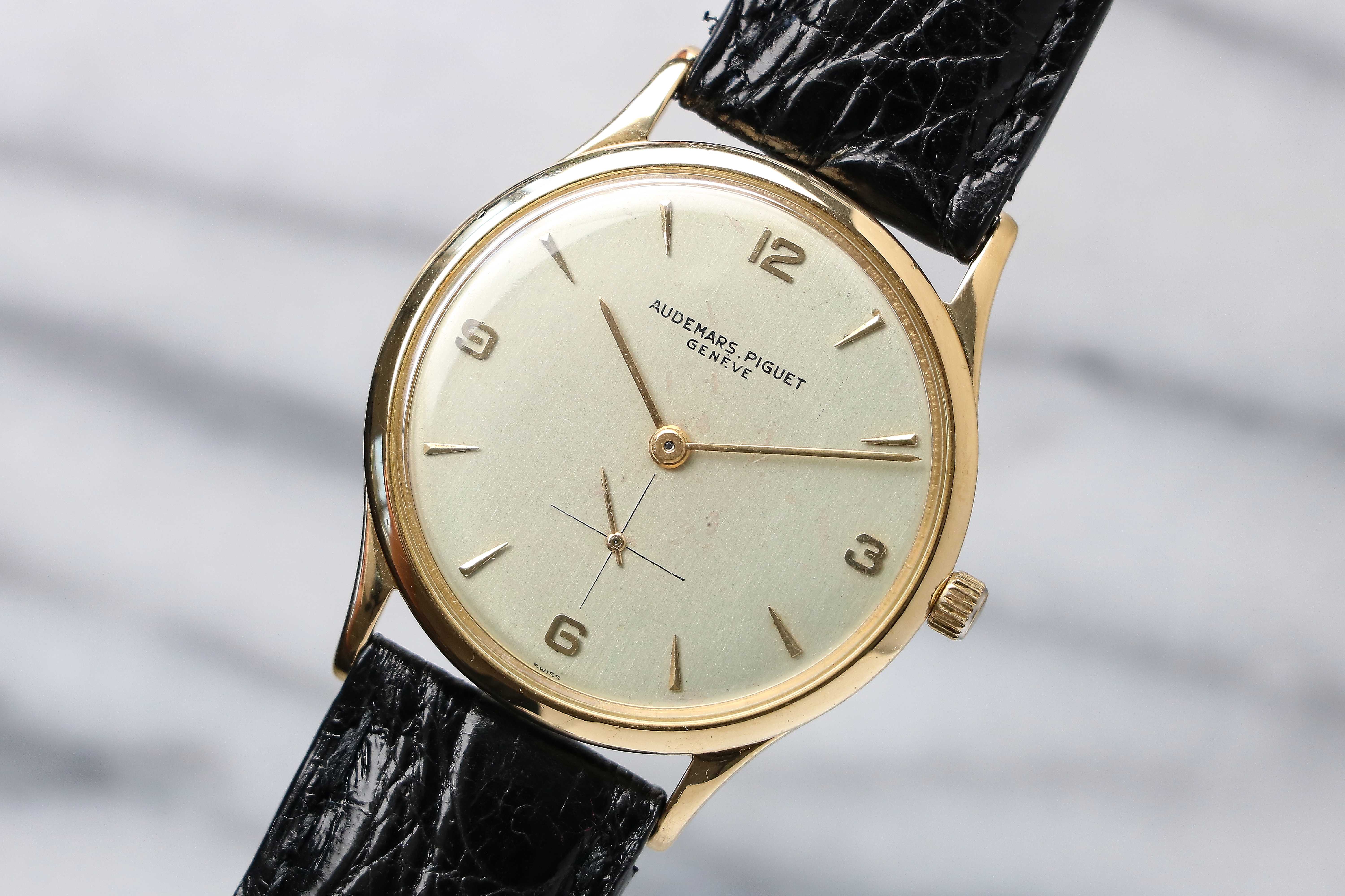
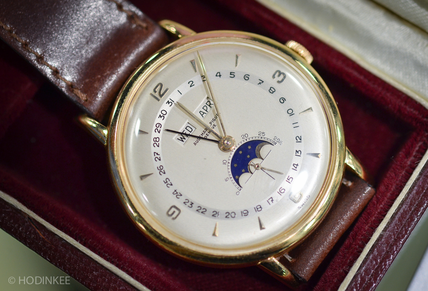
I feel like AP really missed an opportunity to highlight their ability to pull from their archives. While tne numerals and handset feel odd in a modern context they actually pull from vintage AP dress watches of the mid 1900s. Take a look at the 5042BA.
New Dials: The Next Generation
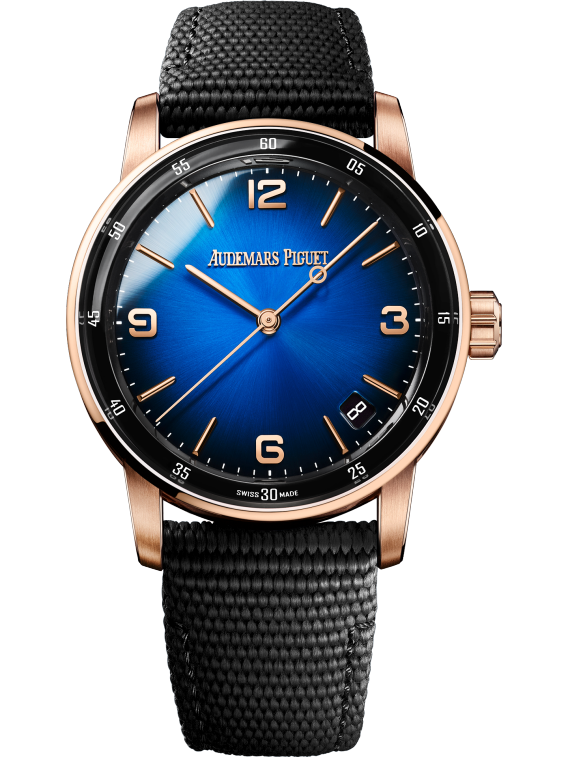
The great thing is though, is that dials are the easiest thing to improve upon in a watch. If the initial release had poor ergonomics, or poor case design, the line is doomed. Dials can always be changed and improved upon. From the intial release AP has iterated and improved upon the dial desgin with each release. The second generation brought us the fume dials.
Ceramic Midcases
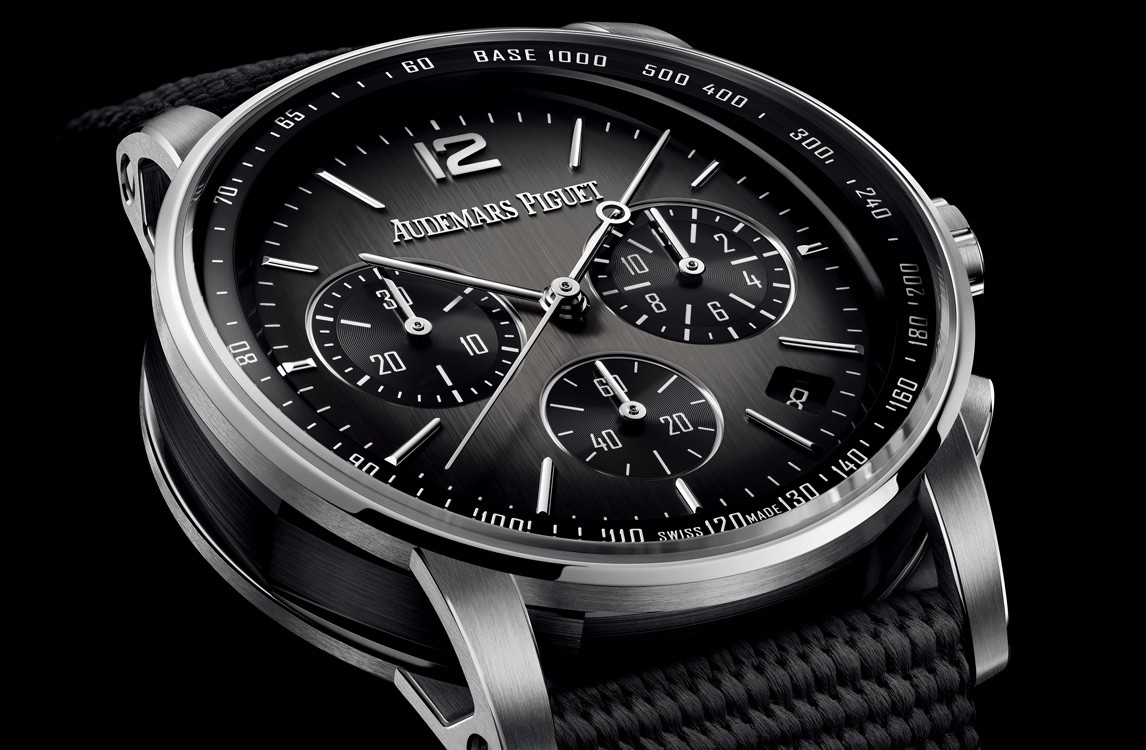
What I like to call generation 2.5 introduced ceramic midcases to the chronographs. This pushed the code even further in the sporty direction and further showed off what AP can do with the line. The newly introduced brushed dial here also works wonderfully with the ceramic midcase really bringing the watch together.
Steel
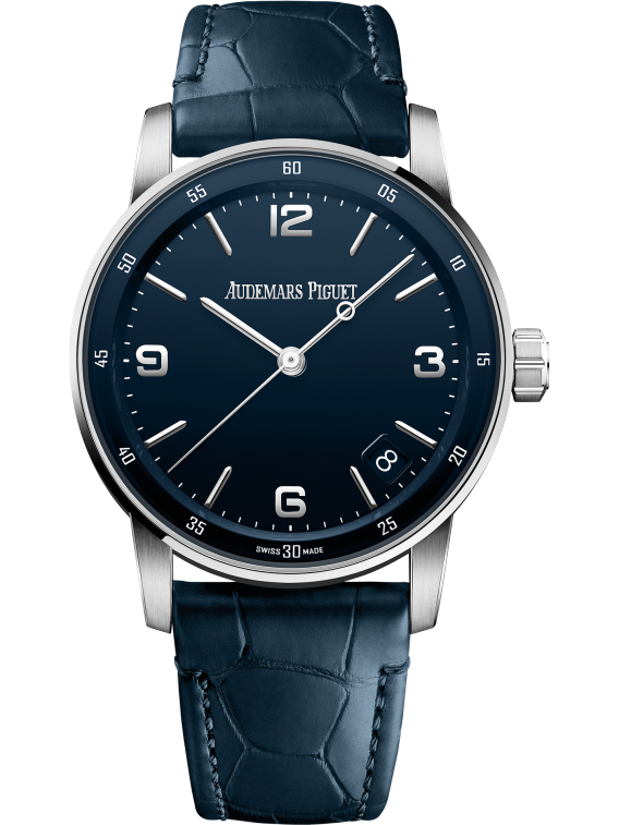
We finally get the CODE 11.59 in steel for generation 3. The initial release in precious metals was likely done out of necessity due to the extreme difficulties in manufacturing this case. As stated previously this watch has so many mixed surfaces and tight tolerances that making in steel is actually a fairly demanding task compared to gold. With this release AP really leans into modern design and creates a CODE that loses all the controversy of the initial release. There's nothing wrong with the steel codes, I just wish if AP was going to commit to this watch in steel we'd see proper water resistance added to it and a full rubber strap making the steel code a strong contender to the aquanaut and the PM code be the contender to the Calatrava. A 2 for 1 in a single line.
Now in 38mm
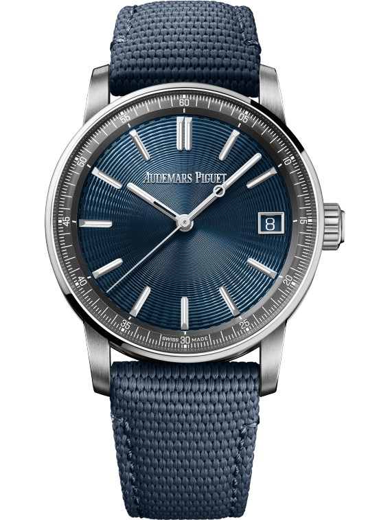
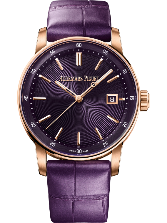
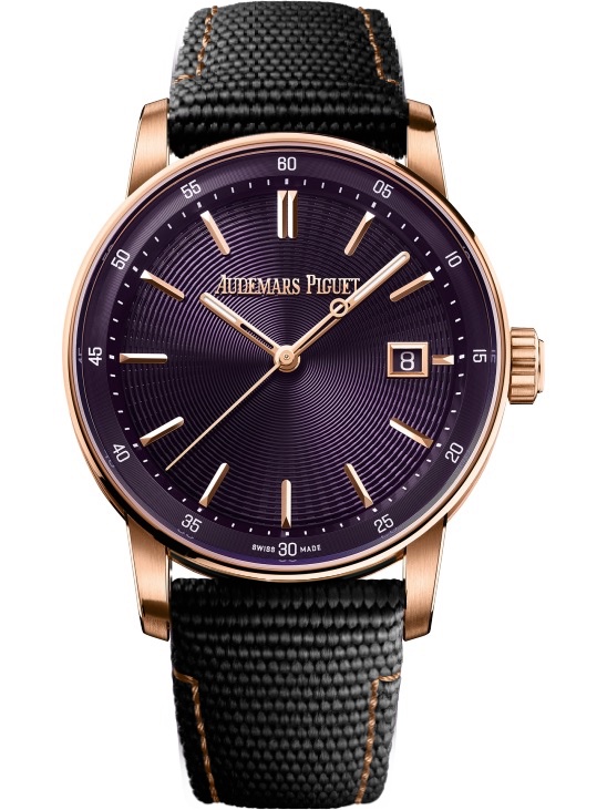
One of the biggest complaints about the code is its size. At 41mm it’s formidable for a "dress watch." AP has recently released 38mm codes which are a hybrid of the steel and PM codes. These use the dials from steel code, but the inner bezels from the precious metal codes.
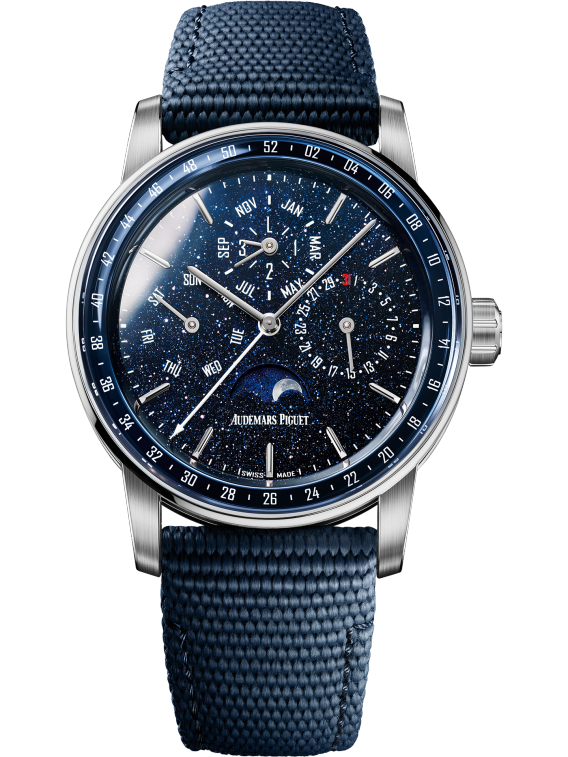
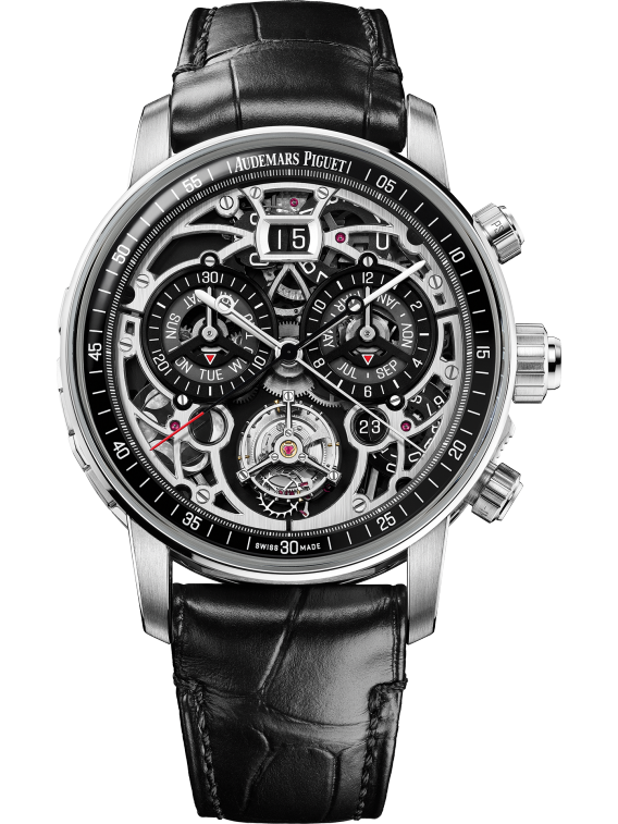
High Complciations
Where the code line really shines is in the complications. The prepeutal calendar on the aventurine dial is one of the most beautiful exeuctions of a aventurine dial I have ever seen. The CODE craves complications. Often times people say the Royal Oak is the greatest blank canvas ever made; however, I think the code gives the royal oak a run for it's money in this regard. Every new complciation introduced to the code creates an entirely new look that might as well be its own line. The QP, Starwheel, and Ultracomplcation are all the same watch but couldn't be more different from each other.
